A Nerds Dilemma
I am a fan of Japanese animation and anime, but I am a huge hater of the options for clothing and stuff to wear that doesn’t scream “I watch anime”. With anything from full images of characters to Japanese letters, clothing options made you stand out from the crowd. I wanted to create a hoodie from one of my favorite shows that didn’t make me stand out.
This hoodie would have designs that reflected the main characters, but would be completely undetectable to anyone who hasn’t seen the show before. So I started on my journey to create a design that was discrete, minimalistic, of good design, and most importantly, it needed to represent the show and the characters correctly.

The Spark of Inspiration
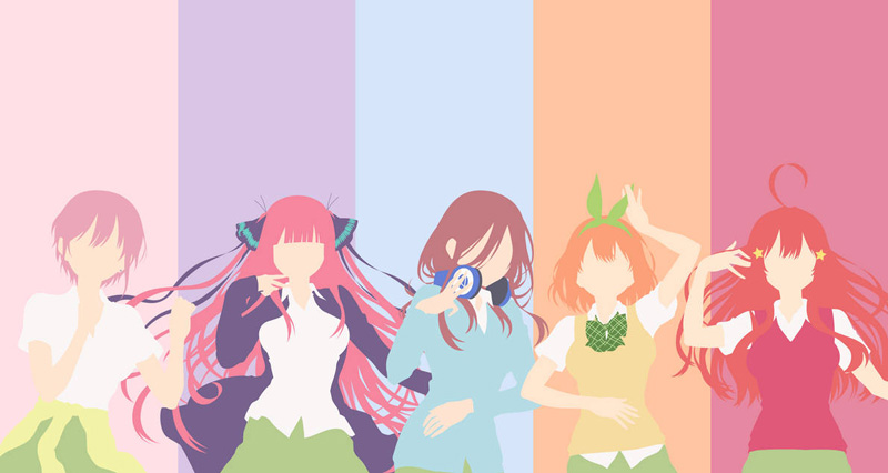
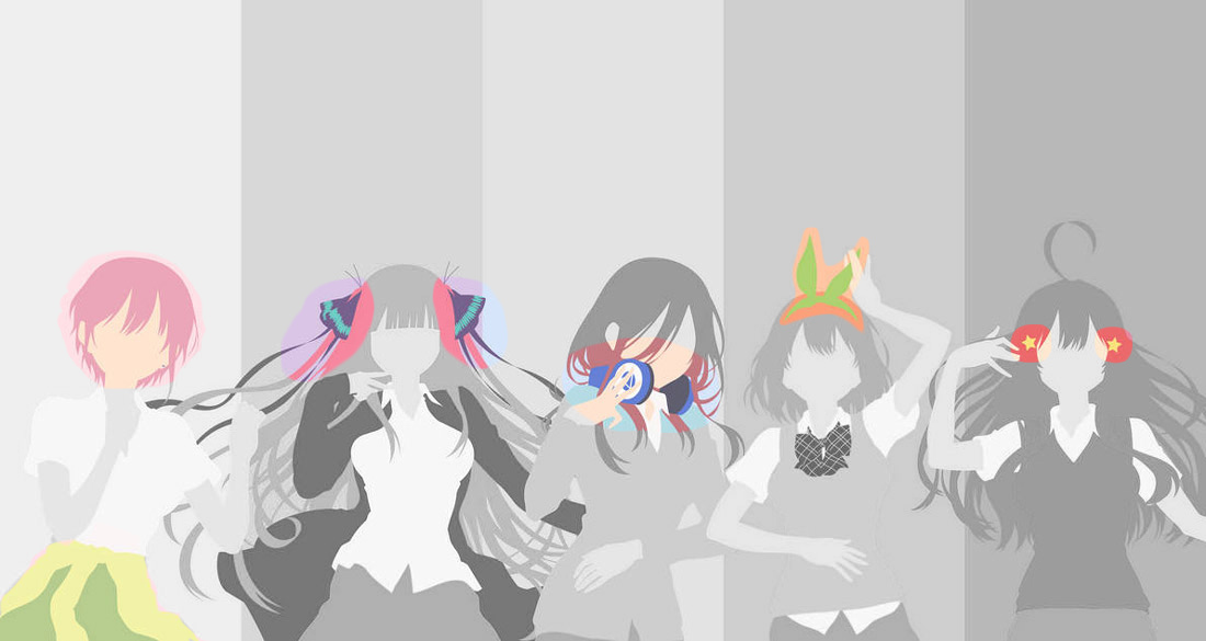
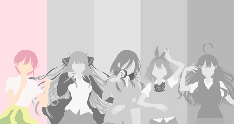
There are 5 main characters for the show that I wanted to focus on. With the show heavily focusing on flowers and roses, I wanted to take the main artistic style of each character and design a rose for each of them. I wanted to take their main key feature into account for every design. This key feature for most of them being a hair ornament that they would always wear. These would be separate designs, and would flow down each sleeve

First Step, The Roses
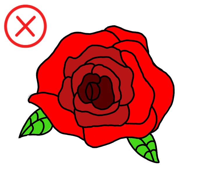
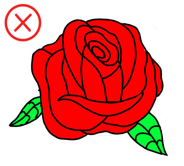
I had two designs in mind that I wanted to try, a top down view and a side profile drawing, but I didn’t like either one. The petals made them too busy and detailed.
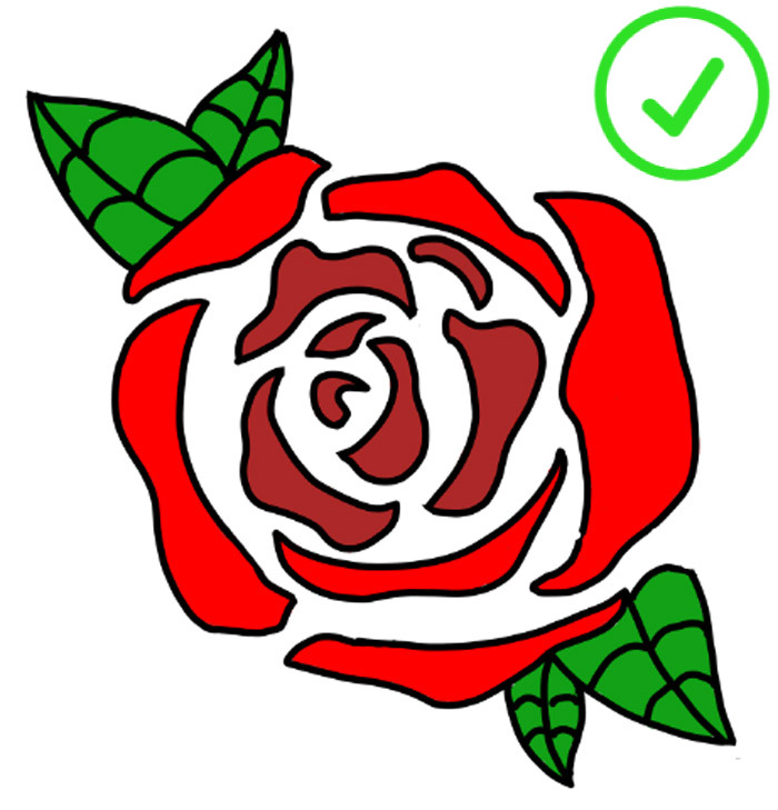
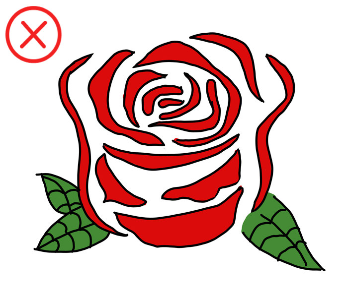
I thought of a simpler drawing with white space in between each of the petals to make it less busy.
I started with the side profile, then drew a top down version again and landed on the design that I knew would be the right fit.
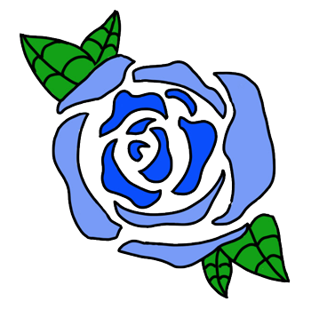
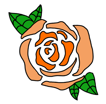
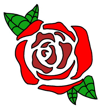
The white space made it very simple yet still recognizable as a rose. It would also be very easy to make changes to if I wanted to modify it later
Color Match
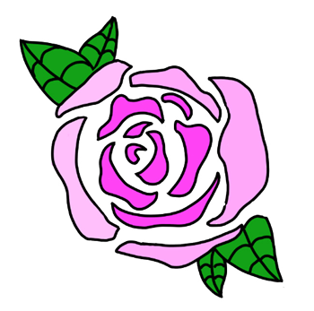
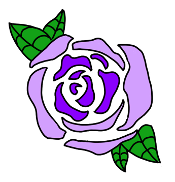
The idea was to have 5 different roses, one to represent each character. Each character has a unique color scheme incorporated into their art styles, and I thought simply changing the colors of each rose would be a great way to show off that style.

Round Two
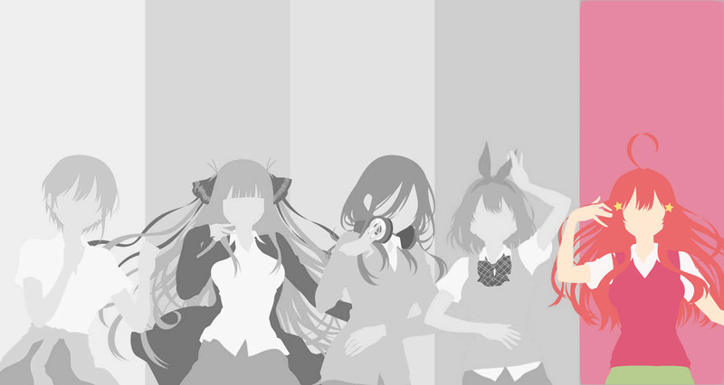
Moving on to the second part of the project, I wanted to include the signature hair ornament that each character wears as part of their identity. These accessories are used as a way to complement the style and personality that each of the characters represent. My favorite aspect of this show is seeing how the creator weaves in different personalities and artistic styles to represent their characters.


Shining Stars
I think the stars are perfect for the bright, shiny, and optimistic outlook on life and the future that this character represents in the show. It is a simple yet lovely style that I wanted to show off.

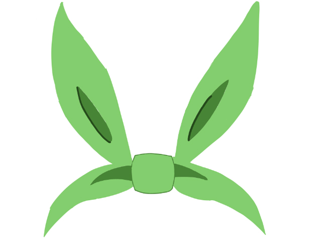
The Ribbon
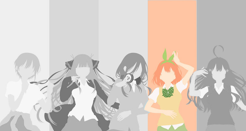
This character is written to have a joyous and bubbly attitude which reflects a child like blissful ignorance. A playful ribbon that’s shaped like bunny ears suits that style and the character perfectly.


Headphones
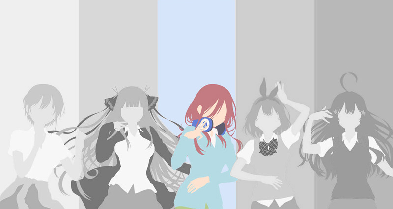
The introvert of the group. Wearing headphones around their neck at all times to have the ability to tune the world out at will. This style of character works as a great contrast to the other optimistic and energetic personalities of the show.

Twin Hair Clips
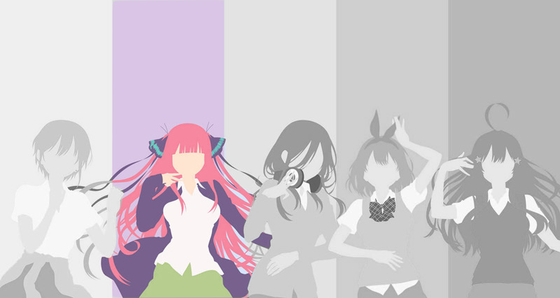
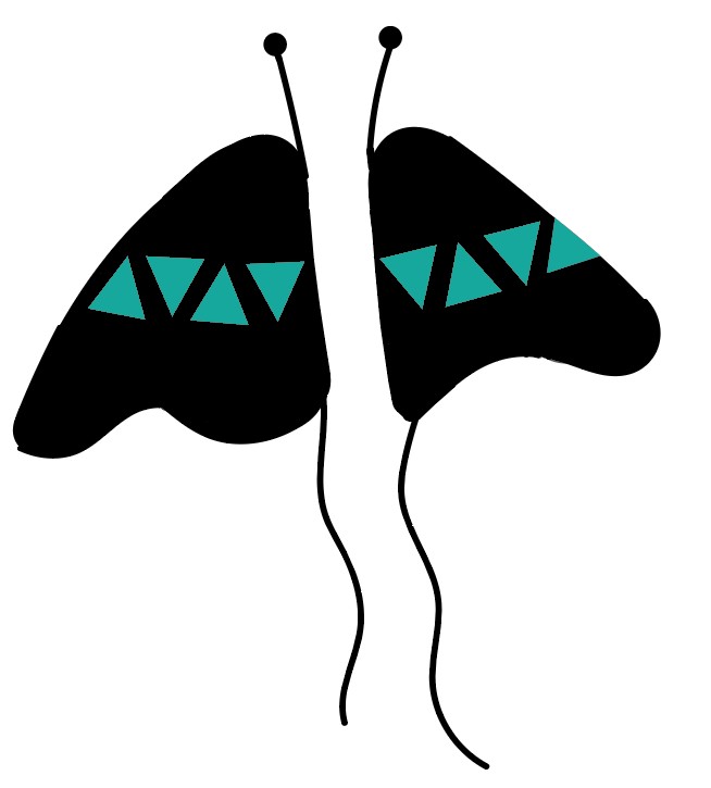
To break out of the shell of your former self and be reborn as a whole new person. I feel that the butterfly created by the two separate hair clips portrays this perfectly. That symbolism also matches the characters style very well.

The Odd One Out
The one that stands out and is different despite what others might think. Going away from the usual trend of the ones around them is the personality that this character embodies.
Causing some problems for me, this character stands out from the rest because they don’t actually wear a hair ornament.
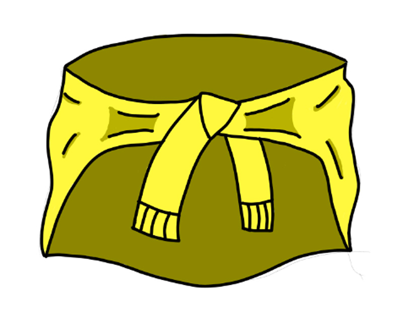
The only thing this character consistently wears is a yellow jacket that is tied around their waist, so this was the only iconic piece that I thought could represent the character.
The Great Merge
I had every design ready to be put on a hoodie, 5 roses down one sleeve, and 5 accessories down the other, but the project didn’t sit right with me. I looked back and saw 10 random designs thrown on a canvas, with no resemblance to any characters. I was torn, I knew I had the right mindset and the right direction, but I needed something to get me to that finish line.
Then it hit me, if the accessories are worn by each character, and each rose represents the characters. Why not let the roses wear the accessories?
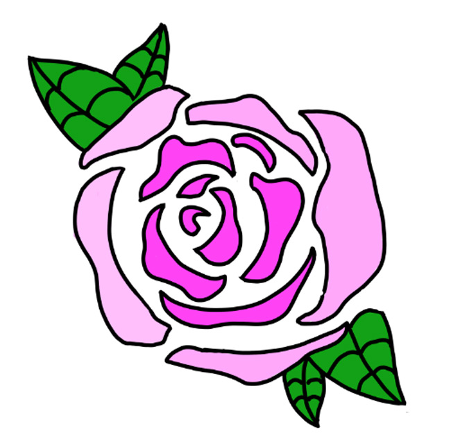
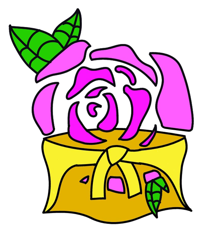

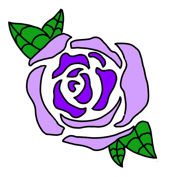
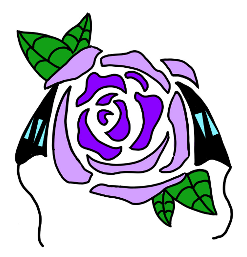

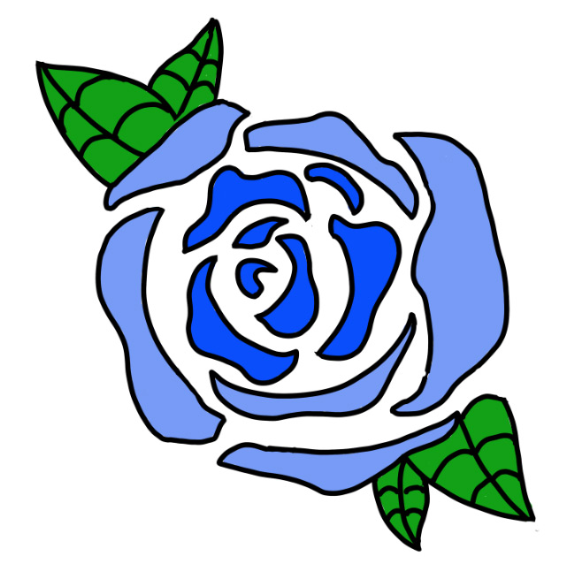
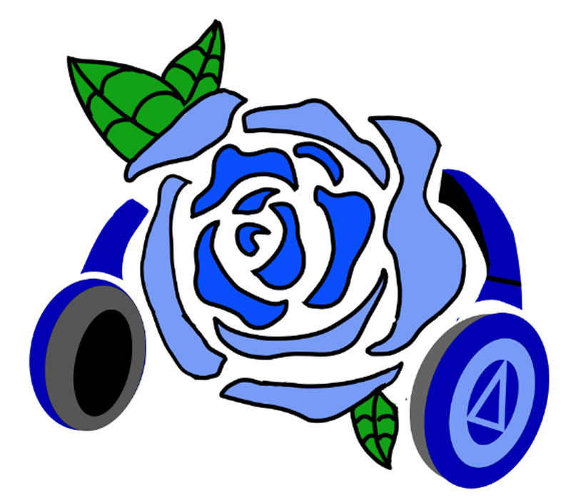

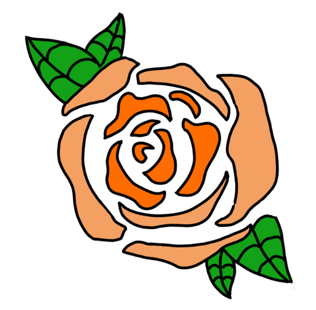
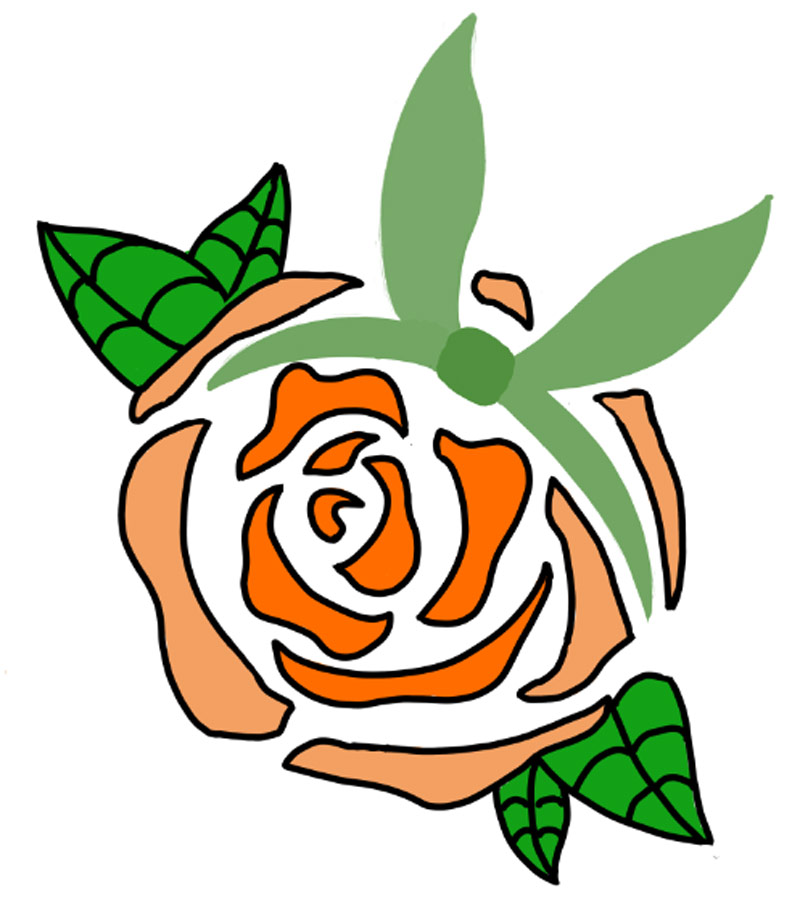

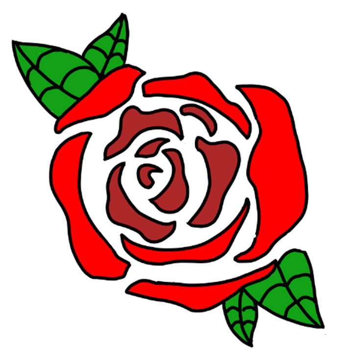
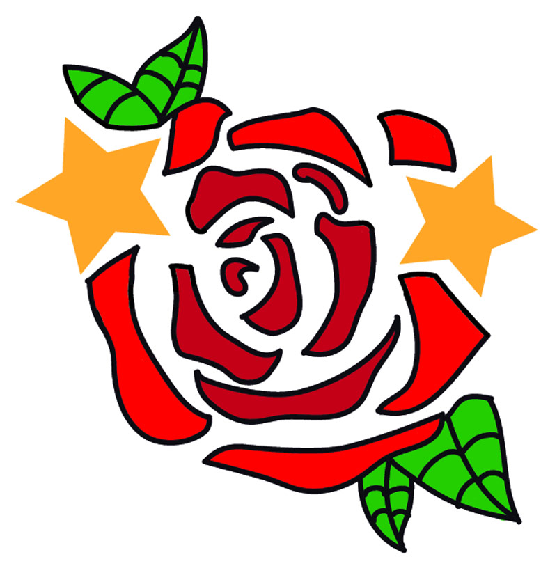

I formed the rose petals around each signature wearable and gave each enough white space to still have room. The result was that final piece that I was missing. I now had designs that were cohesive and represented each individual character without being loud and making myself stand out.
Creating these designs ignited the creative fire inside me and motivated me to make more designs for other clothes and hoodies. Not only creating the designs, but creating this case study website was a ton of fun and I got to learn a lot. Creative projects like these have always been a favorite of mine.
If this seems similar to a project you are working on, I would love to be able to help and contribute all that I can to the project! Please reach out to me using the methods below!
Email: jason.erlandson@yahoo.com
Linkedin: www.linkedin.com/in/jason-erlandson
